
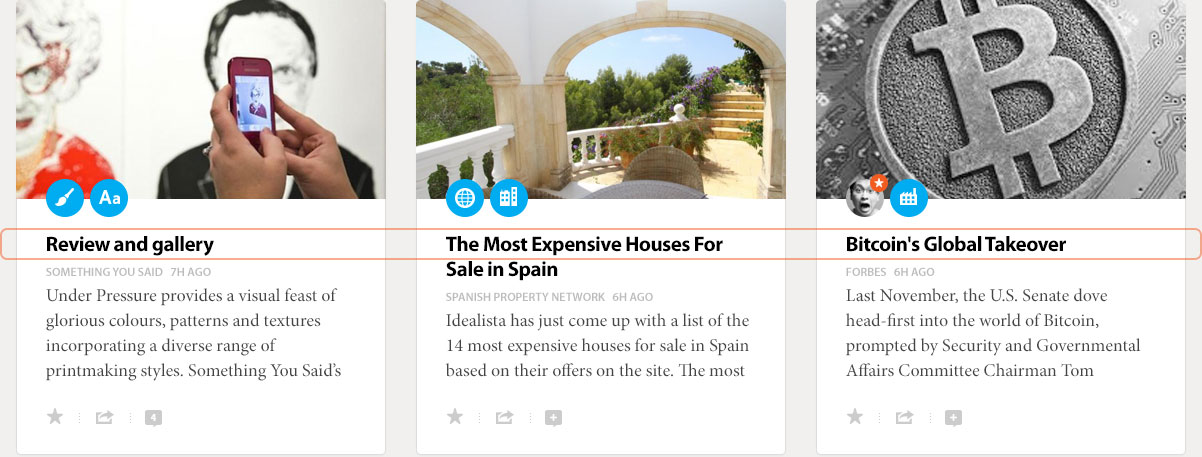
One Feed For All Your Interests
We are overloaded with information so we need filters, but the only filters we have stick us in a bubble.
We think the solution to this problem lies in combining two new models: follow anything, and smarter sorting.
Following anything means that you can follow things like topics. On social networks, you just follow people, and in newsreaders, you just follow publishers. Neither of these models work well to bring together a single feed for all your interests.
Smarter sorting means that we ensure the best stuff shows up at the top of your feed. In order to do this, we need to learn about specific preferences for each customer, network preferences expressed through the social and interest graphs, preferences we learn about through what people follow and interact with, the general and topical authority of people and publishers, and how to deliver a healthy dose of intentional serendipity.
We think the combination of these two models, follow anything and smarter sorting, can solve the content filtering problem and have big positive impact on the quality of content people read.
Making Prismatic
The lay of the land
Prismatic started out back in 2011 as a smart, personalized newsreader for the Web and iOS. It was pretty basic, but with very little explicit input from a user it seemed to know what you were interested in. Like many new products, it wasn’t without its faults. The article parsing was awesome when it worked, but it would sometimes fail, leaving you with a slightly frustrating experience. It was a forgivable flaw at the time because the payoff was great enough. Back then, the typography was less than perfect, and the UI was trying to do too much on the Web—all at the expense of the content. Despite its shortcomings, It was still a good destination site and iOS app that allowed you to get a quick fix of content that you probably hadn’t seen yet on Facebook or Twitter.
The early iOS version of Prismatic was fairly well concepted and designed. Simply follow topics and publishers and let Prismatic do the rest.

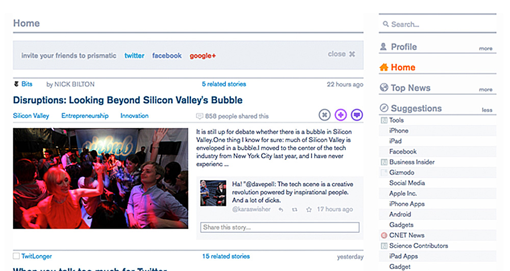

Some examples of the desktop experience before we started.

“The iOS app showed great restraint, but the UI on the Web was trying to do too much.”
An honest conversation
Geoff Teehan was in San Francisco working on another project when a coworker suggested he meet with one of the founders of Prismatic, Bradford Cross. He was curious to know what Geoff thought of his product. Geoff gave him a pretty honest personal assessment. He explained what was most impressive, was how Prismatic would show the things based on legitimate interests in things like architecture, cars or food—even though 95% of what he followed on most networks was related to Design and Technology. Geoff went on to tell Bradford his gripes on the Web experience too. Namely, that “The headlines were taking a shit-kicking”. He said this in reference to the cluttered interface that was doing too much heavy lifting. The iPhone app was better by far at navigating that mess, mostly because mobile design forced them to remove the stuff that wasn’t important.
After a few hours of chatting about everything from broad product goals right down to the smallest executional details, Bradford enlightened Geoff on a much more ambitious goal: Prismatic wanted to become the home for your full spectrum of interests. That’s an ambitious goal that they hadn’t yet begun to scratch the surface on. The team at Prismatic was thinking big, but up until then, they had been heavily focused on creating a solid back-end to support the future experience they so desired to create.
We stayed in touch over the next number of months, eventually deciding to work together.
A familiar problem space
One of the main things Prismatic wanted us to focus on were design systems that were flexible enough to deal with the content that flows through their system. This was, and continues to be a complex problem—one that we had a good deal of experience on. We were fresh off of working on Medium so this was all very top-of-mind. Plus, we had previously worked on design systems for Readability, The Globe and Mail, Toronto Star, Tweetmag and a few others.
In addition to the technical challenges, these kinds of systems are awfully difficult to design for. Mikael, Nate, Francisco and Gina (a few of Prismatic’s designers) know this all too well. One of the biggest challenges here is that the ‘stuff’ you’re dealing with approaches infinity in terms of variability. Think about it: You need to design a system that works for every piece of content ever written in the past, but also has the flexibility to work with content that has yet to be written. At the same time you need to balance loads of UX elements and variables like interactions, commenting, what’s inside the system, what’s outside the system, media types, topics, summary abstracts, body, content source, your connection to the content, actions you can take or have taken etc. In the truest sense of the word, it’s awesome. Just when you think you have a solution, you realize there are half a dozen things that break it.
There are other considerations when designing systems like this too. Things like the length of headlines and the contrast of images and other media can play havoc with making everything work harmoniously. You constantly need to ask yourself: Does the content stand out enough? Are the right actions available at the right time? Are they obvious? Are the distinct pieces of content tied closely enough together to look like a continuous feed, but separate enough to look distinct? Can I scan it? Can I read it? Is the design ownable? Is it too generic? Does the design detract from the content? Does the design get in the way of the experience, or enhance it? Some days you walk away only understanding things that don’t work. Simultaneously, you gain a true appreciation and respect for the people behind those massive systems that so many designers love to hate on.
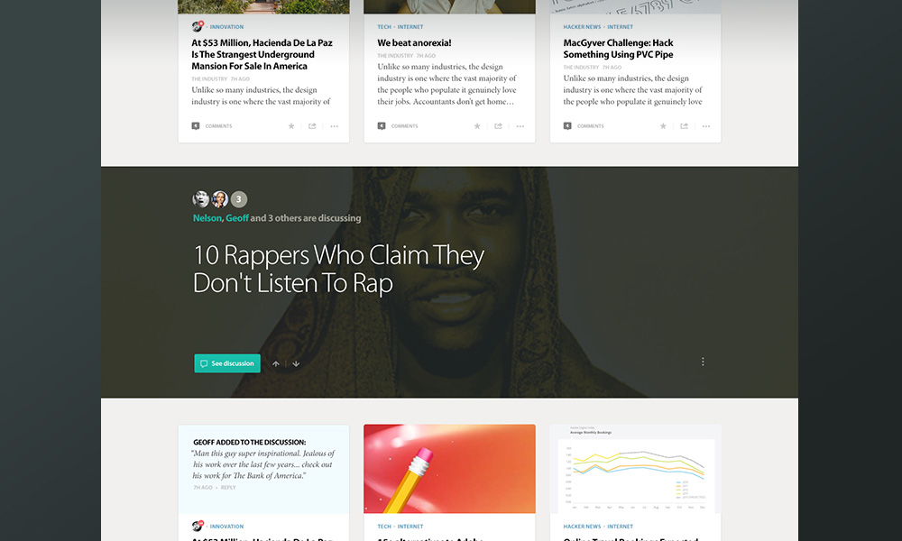
Some days you only walk away understanding the things that don’t work.
Bradford and his team recognized this wasn’t something we would fully solve in an iteration or two. This was incredibly complex work—both to think through, and to execute. It was, and frankly is, going to continue to take a lot of smart people, time, explorations, research and iteration.
A Human Element
There can be a tendency to make things overly generic looking when designing a system that serves up a variety of content from a slew of sources. It was important to us early on to explore how Prismatic as a brand would be positioned in a system like this. Bradford had outlined a number of things that he felt were important to the system’s design. So much of what they do revolves around creating incredibly complex, smart and logical systems. He wanted the design to instill a human aspect. Its colours, shapes and type needed a certain softness, or as he liked to put it, a human element.
Focus
Whether you’re building something new or continually improving an existing product there is never a shortage of things to do. Focus can be the biggest hurdle when working on a product. If you try and do too much at once, nothing gets done, or at least done right. This happens, not just because of the number of tasks, but because it’s harder to prioritize them. Moreover, the interdependancies can cause everything to grind to a halt. The main reason we focus and limit the amount we’re trying to do is because it forces us to work on what is most important to the people using the product or service.
In the case of Prismatic, we wanted to explore three main things.
- Content - What system we could use to display the vast array in a consistent and logical manner?
- Explains - Why are you seeing what you're seeing?
- Discussion - How do we display active discussions? How do you engage with items and discussions?
Of course, there were other things we’d have to touch on throughout our work, but these were what was deemed most important to the people using Prismatic.
Rapid Feedback
Getting feedback from outside the walls of the office is important during any design process. Working purely on intuition, past knowledge, or whatever else, can be good enough sometimes but many times it doesn’t get you to the best solution. It’s still pretty easy to get caught post-launch realizing you missed something that could have been caught earlier.
Francisco, a designer there, helped us run very rapid tests with real users in an effort to take some of the guess work out of deciding between multiple viable options. As an example, we were working through what the ’Like’ icon would be for items. We had a lot of ideas. Some of them very obvious, others more ownable, but obscure. We wanted to figure out what option we should go with (or if there were a couple worth a/b testing). We quickly agreed on what artifacts we’d need to create for the test, test it, and then assess the results. This would easily all happen on the same day. And, while the tests were conducted we’d be working on another aspect of the product. It was an incredibly effective and efficient way to work.
For example:
Finding Prismatic’s ‘Like’ button
The icons clearly weren’t perfect in terms of their design or polish, but they did convey the idea. In other words, they were as good as they needed to be for the test. This wasn’t about finding the actual element, it was about understanding what direction worked best.
What We Made
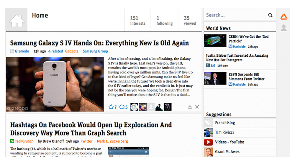
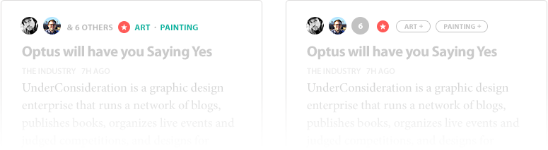
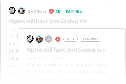
Prismatic had a strong desire to move to a better card based layout. Layouts like this can offer some benefits; More stories on the screen, and, they can be easily be made to work across a number of surfaces. They also have some issues though. For example, it can be hard to scan headlines when they cards sit in columns and rows. The alignment of objects, baselines etc can also be very tricky to achieve without sacrificing design integrity.
Having worked on systems like this before we knew what we were in for. In the end, we were happy with the outcome of the card approach, but are glad to see Prismatic is pushing the boundaries on this front and are rethinking the card system in upcoming versions. Below are some things that stood out as the difference-makers and should be considered when designing a grid.
One Baseline

Usually, you set a line-height that works for the title and one that is appropriate for the body. The thing is, unless the number of lines in the headline are equal for every item, the baseline will get out of alignment. We worked really hard to figure out how to solve this. It was the only way we could save the text from becoming mis-aligned or creating widows, etc. The big disadvantage with aligning baselines in this manner is that we limit the amount of contrast the font stack can have in terms of size. To help compensate for this we looked to colour. When we look back at this, even now, it seems pretty trivial, but this took an enormous amount of exploration to get right.
Aligning headlines
Explains
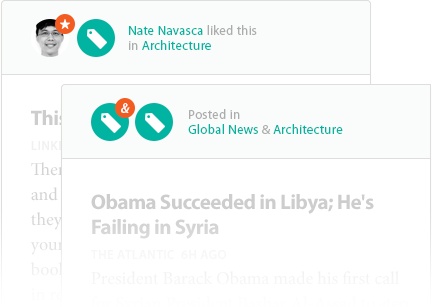
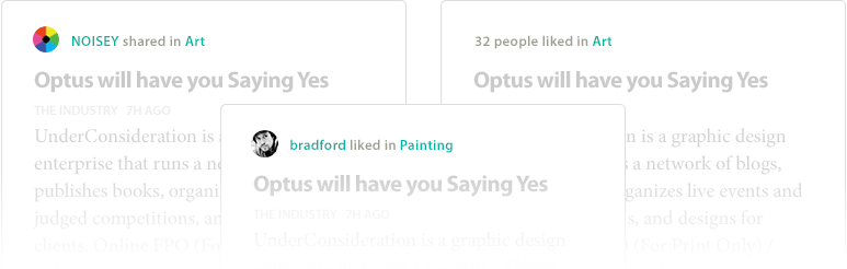
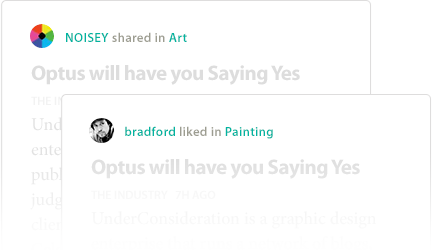
Prismatic was doing a great job of presenting content that suited your interests, but there were times where it wasn’t clear why something was being shown. We wanted to create a subtle area or element that would help provide context as to why you were seeing something. For example, If you’re seeing something that doesn’t appear to be tied to a topic that you’re interested in, then it’s important to know that you’re seeing it because someone you follow wrote, or shared it.
Icons and Avatars
Early concepts used icons and avatars to help explain why you were seeing a post. An obvious problem here is that we’d have to create a near endless collection of icons—Some of which would be obscure and difficult to decipher.
Adding more Clarity
Another failed idea: If the icons weren’t in the library we could default to generic ‘topic’ icons. This later concept introduces copy to help explain these things more, which defeats the purpose of an icon all together. a little clearer.
More failed Attempts
Design is often a process of going too far, then stripping things back. We were clearly pushing concepts beyond a breaking point. It’s at points like this where you can really see where and what needs to be simplified. The concept below is what would eventually make it into production.
Trimming the Fat
Taking a Breather
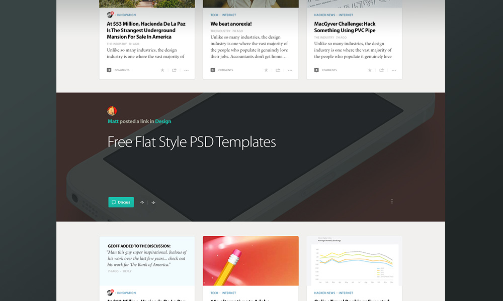
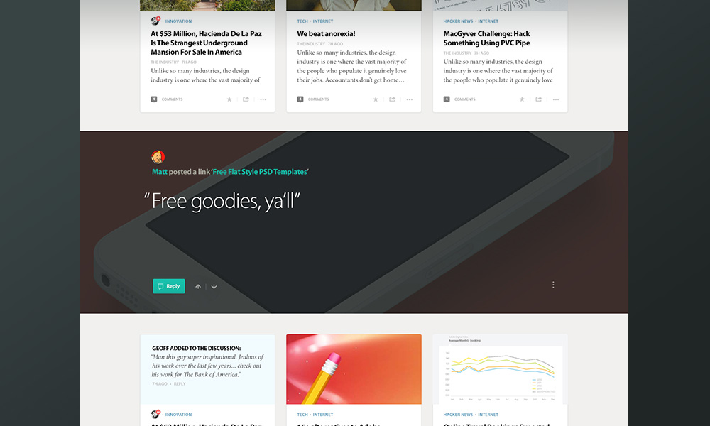
Whether we had gone with a grid or a list, we run into an issue where an endless scrolling wall of content becomes overwhelming. We were finding that after 4 or 5 scroll-views of items our eyes would begin to glaze over. We wanted to create some natural breaks to help alleviate this. These were going to be areas, not to distract, but to help promote things of interest. We came up with a dozen different relevant ways to use it. For example, We could use this area to feature an item shared across multiple people or interests you follow. We could also use it to help introduce you to new, related topics of interest during onboarding.
Examples of content interstitials
External vs. Internal
Up until now, Prismatic only had to deal with content that existed outside of their product. Meaning, you couldn’t actually create or post your own content from Prismatic itself. Bradford wanted to explore ways not only enable this, but to differentiate content that was being produced from inside of Prismatic, rather than from an outside source.
Grids vs Lists
Right from the beginning, there was hesitation from both sides about designing the grid. We felt like we got some things right inside of this iteration, but we're happy to see that some recent tests and results are showing that the list-based designs tested much higher. Prismatic recently posted a fascinating article on all of this work. In it they reveal the process and results of the work done on this front.
Even with the work we did, and this most recent release of Prismatic, it's still just the beginning. Be sure to check out the current desktop experience or download the app on iOS and see for yourself.
What We Learned
A successful product is never done or perfect.
 Geoff Teehan, Partner
In the end, a successful project is never done. It is never perfect. If you aren’t learning from it, then you’ve given up. It’s a constant process of assessing the landscape, making hard choices and accepting trade-offs. It takes passion, dedication, design, engineering, planning, talent, time, iteration, research, occasional moments of blind faith and a dozen other things I’ve forgotten to mention. If you’re lucky enough to have all those things, you need only rely on perseverance, though a dash of patience and funding doesn’t hurt.
Everything can’t be a priority.
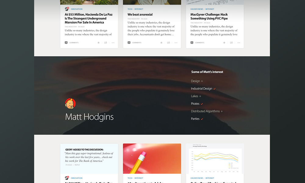
 Matt Hodgins, Designer
Choosing a few things to focus on is crucial to a successful project like this. Even if one of the three things you’ve chosen to work through isn’t right, it’s okay. It will still be better than trying to tackle a dozen things all at once.
‘Done’ is better than ‘perfect’.
 Nelson Leung, Designer
As designers, it’s all too easy to get caught up in the pixels. That isn’t to say pixel-perfect work isn’t important. To us, recognizing when to focus on it, is what’s important here. The work we did with Prismatic early on was about getting things close enough, then putting it in front of actual people to understand if our approaches were working. Only once we knew that would we shift focus to the final pixels.